Give me something
Thursday, August 19, 2010
Extreme Isolation

What makes them extreme? They utilize specially designed earmuffs that passively attenuate surrounding sound by 29db and custom fitted high-quality, speaker assembly. Because of the extreme surrounding sound isolation, it is only necessary to use the headphones at medium to low volume resulting in less ear fatigue and less risk of hearing defects.
Wednesday, August 18, 2010
Monday, August 16, 2010
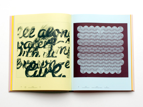
Singing type

Song lyrics brought to (visual) life by typography and design
The TypoLyrics section in the German typography magazine Slanted is an experiment in bringing together song texts and typography, writes Yves Peters. Slanted has turned this popular section into a book featuring 170 new contributions. Celebrated graphic designers as well as talented young designers from all over the world were asked to create typographic interpretations of song lyrics.
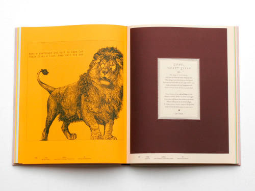
Above: Amon Düül II, ‘Archangel Thunderbird’ (George Triantafyllakos, typeface: BP Mono Italics / John Dowland, ‘Come Heavy Sleep’ (Hannes von Döhren, typeface: Opal Pro)
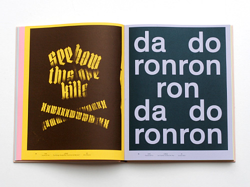
Below: The Dillinger Escape Plan, ‘Sunshine the Werewolf’ (Chris Steurer, typeface: Hunstruct Tall) / The Crystals, ‘Da Doo Ron Ron’ (Vincent Sahli, typeface: Theinhardt Pro)
In analogy with traditional type classification, the illustrations are grouped in eleven chapters according to musical styles. Each genre is coupled with a particular type style, for example stencil for Punk or monospaced for Krautrock. The book opens with a foreword by Max Dax, interviews with Stylorouge, Dirk Rudolph and Invisible Creature, plus a comment by Frank Wiedemann who selected most of the songs. The end pages list the contributors and the typefaces used.

Above: Miss Kittin, ‘Kittin is High’ (Matthias Christ, typeface: Rauschen) / Faithless, ‘Insomnia’ (Dirk König, typeface: Frac)
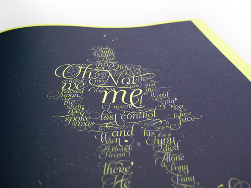
Below: David Bowie, ‘The Man Who Sold the World’ (Sabrina M. Lopez & Maximiliano R. Sproviero, typeface: Aphrodite Slim)
As is to be expected in this type of book, the work presented is very eclectic, and inevitably some pages are not as successful as others. Yet most designs are imaginative and offer surprising visuals, like Daniel Bär’s exuberant interpretation of Zoot Woman’s ‘Nu-Disco’, or Franzi Kahle’s visceral painting for ‘Je t’aime … Moi non plus’. This book confirms that great type designers seldom make great graphic designers. Their efforts to present their typefaces as favourably as possible sometimes fall short in the design department – a noteworthy exception being Andrea Tinnes’ brilliant visualisation of the angular, cut-up R&B of Lady Gaga’s ‘Telephone’ featuring Beyoncé.
TypoLyrics is a beautifully produced hardcover book, printed in simple black on coloured stock – a different colour for each chapter. As the ink for the covers was gradually changed during printing and the volumes randomly put in the boxes, each cover has a unique colour. TypoLyrics shows an interesting cross-section of contemporary graphic design and examines the intriguing interaction between the music, the meaning of the lyrics and their typographic interpretation.
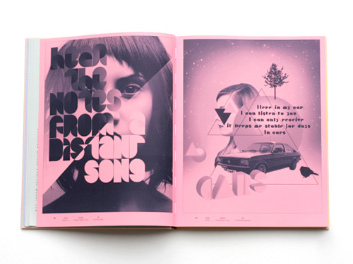
Above: Visage, ‘Fade to Grey’ (Anthony Dart, typeface: Statistic) / Gary Numan, ‘Cars’ (Kristina Klinkmüller)
Below: Van Morrison, ‘Brown Eyed Girl’ (s-w, typeface: Susa) / Bill Haley, ‘See You Later Alligator’ (Elena Albertoni, typeface: The Antiqua Ornaments)
EYE BLOG
Arcade Fire's Synchronised Artwork

Back in 2007, director Vincent Morisset reinvented the music video online, with his interactive promo for Arcade Fire track Neon Bible. For the band's latest album, The Suburbs, Morisset has now turned his attention to how digital music files could be more visually exciting...
Morisset has worked with designer Caroline Robert to create a digital artwork that appears when the album is played on mp3 players like the iPod or iPhone. The work deliberately echoes the pleasures of old vinyl record sleeves, where the song lyrics were often written out in full. Each track on the album has an individual image that appears on the iPod screen when it is played, with the lyrics of the song then appearing on the screen as they are sung.

"Win [Butler, Arcade Fire's lead singer], wanted to create a version of the artwork that would be relevant in the digital world," explains Morisset on his website. "Most of us now buy, share and listen to music through computers and portable devices. It seems absurd that it is still a single jpg that is attached to an album in 2010."

"I thought about the relation we have with the vinyl cardboard cover or the paper booklet while listening to the songs. Flipping through the lyrics, looking at a band picture or a cool drawing related to a song while listening to it. With the mp3 player, we lost that. I wanted to find a way to get closer to that experience again."

As with his Neon Bible video, part of the success of the Synchronised Artwork is its simplicity. Explaining how it works, Morisset says, "Tightly sync a series of images with specific moments in a song using the m4a format. Like some podcasters do, but with micro chapters for each line of the lyrics. In addition to that, we were able to add good old hyperlinks also synchonised to the song. This gives the possiblity for the band to add, at any moment, all kinds of references related to each song. They plan to change and update those links occasionally."

The handwritten presentation of the lyrics on the screen works perfectly with the artwork that Caroline Robert designed for the album, which includes photographs shot by Gabriel Jones in the suburbs of Houston. To experience the Synchronised Artwork for yourself, head online to arcadefire.com, where it is included with the purchase of any digital download of the album.
CREATIVE REVIEW BLOG
8 different covers:
http://embed.arcadefire.com/artwork/artwork_jpeg.html
Skip full of records in soho
"So what's this all about? Well, turns out that long established Soho record shop, Harold Moores (specialist in classical and jazz releases), is closing for a re-fit. In order to prepare the shop for its revamp, staff are chucking out thousands and thousands of records (well over 20,000 by my reckoning) - which were dumped, rather unceremoniously, in a skip outside the premises...
But that's not to say the records are destined for landfill just yet. During my lunchbreak I stumbled across this scene of vinyl hungry people clambering over each other to grab a few vintage slabs of wax..."
CREATIVE REVIEW BLOG
Subscribe to:
Posts (Atom)