
Song lyrics brought to (visual) life by typography and design
The TypoLyrics section in the German typography magazine Slanted is an experiment in bringing together song texts and typography, writes Yves Peters. Slanted has turned this popular section into a book featuring 170 new contributions. Celebrated graphic designers as well as talented young designers from all over the world were asked to create typographic interpretations of song lyrics.
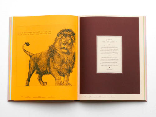
Above: Amon Düül II, ‘Archangel Thunderbird’ (George Triantafyllakos, typeface: BP Mono Italics / John Dowland, ‘Come Heavy Sleep’ (Hannes von Döhren, typeface: Opal Pro)
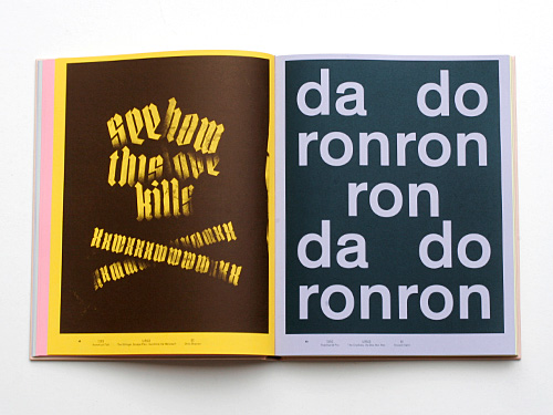
Below: The Dillinger Escape Plan, ‘Sunshine the Werewolf’ (Chris Steurer, typeface: Hunstruct Tall) / The Crystals, ‘Da Doo Ron Ron’ (Vincent Sahli, typeface: Theinhardt Pro)
In analogy with traditional type classification, the illustrations are grouped in eleven chapters according to musical styles. Each genre is coupled with a particular type style, for example stencil for Punk or monospaced for Krautrock. The book opens with a foreword by Max Dax, interviews with Stylorouge, Dirk Rudolph and Invisible Creature, plus a comment by Frank Wiedemann who selected most of the songs. The end pages list the contributors and the typefaces used.
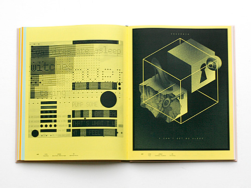
Above: Miss Kittin, ‘Kittin is High’ (Matthias Christ, typeface: Rauschen) / Faithless, ‘Insomnia’ (Dirk König, typeface: Frac)
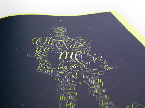
Below: David Bowie, ‘The Man Who Sold the World’ (Sabrina M. Lopez & Maximiliano R. Sproviero, typeface: Aphrodite Slim)
As is to be expected in this type of book, the work presented is very eclectic, and inevitably some pages are not as successful as others. Yet most designs are imaginative and offer surprising visuals, like Daniel Bär’s exuberant interpretation of Zoot Woman’s ‘Nu-Disco’, or Franzi Kahle’s visceral painting for ‘Je t’aime … Moi non plus’. This book confirms that great type designers seldom make great graphic designers. Their efforts to present their typefaces as favourably as possible sometimes fall short in the design department – a noteworthy exception being Andrea Tinnes’ brilliant visualisation of the angular, cut-up R&B of Lady Gaga’s ‘Telephone’ featuring Beyoncé.
TypoLyrics is a beautifully produced hardcover book, printed in simple black on coloured stock – a different colour for each chapter. As the ink for the covers was gradually changed during printing and the volumes randomly put in the boxes, each cover has a unique colour. TypoLyrics shows an interesting cross-section of contemporary graphic design and examines the intriguing interaction between the music, the meaning of the lyrics and their typographic interpretation.
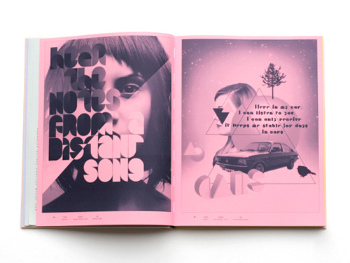
Above: Visage, ‘Fade to Grey’ (Anthony Dart, typeface: Statistic) / Gary Numan, ‘Cars’ (Kristina Klinkmüller)
Below: Van Morrison, ‘Brown Eyed Girl’ (s-w, typeface: Susa) / Bill Haley, ‘See You Later Alligator’ (Elena Albertoni, typeface: The Antiqua Ornaments)
EYE BLOG
No comments:
Post a Comment